React Native Pickers
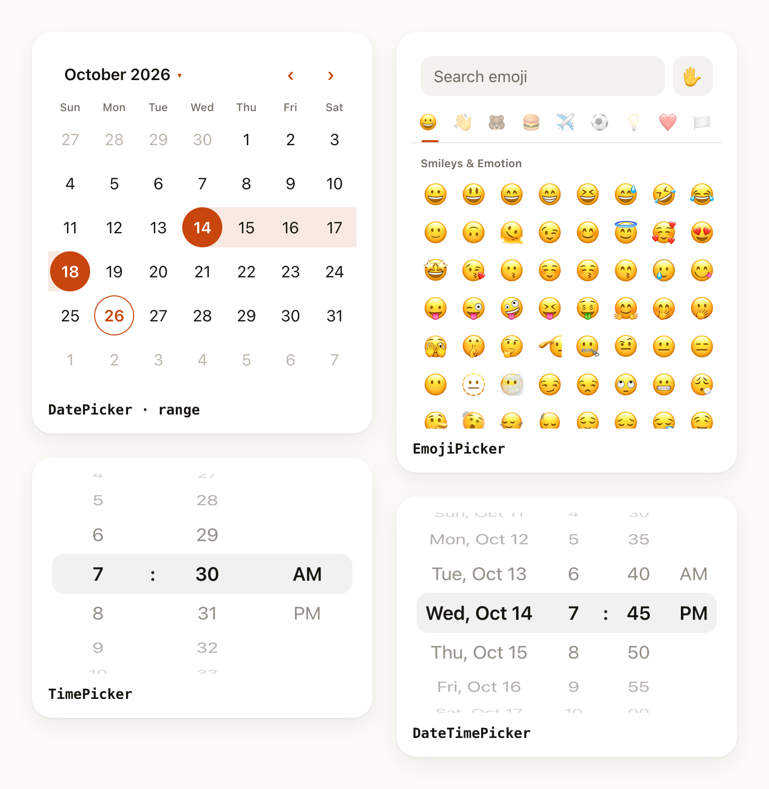
One dependency-free package for every picker a React Native app needs — wheel, time, date (calendar, range, multiple, wheel), select / dropdown, emoji, and the bottom sheets to put them in.
- npm
- yarn
- pnpm
- Expo
npm install @elik56a/react-native-pickers
yarn add @elik56a/react-native-pickers
pnpm add @elik56a/react-native-pickers
npx expo install @elik56a/react-native-pickers
It is 100% JavaScript with zero native code, so it runs unchanged in Expo Go, bare React Native and React Native Web. There's no pod install, no rebuild and no config plugin.
Result
Loading...
Live Editor
import { useState } from 'react';
import { DatePicker } from '@elik56a/react-native-pickers';

export default function Example() {
  const [date, setDate] = useState<Date | null>(new Date());
  return <DatePicker value={date} onChange={setDate} minDate={new Date()} />;
}
Every example on this site is live
Edit the code and the result updates instantly. Each example is a complete file you can copy into your app as-is, imports included.
What's included
| Component | What it is |
|---|---|
WheelPicker | iOS-style 3D wheel with infinite loop, disabled items, tap-to-type, custom rows |
MultiWheelPicker | Several wheels sharing one selection band (durations, units, anything multi-column) |
TimePicker | 12h / 24h (auto from locale), minute & second steps, min / max time |
DatePicker | Calendar with single, range and multiple selection, or a day/month/year wheel |
DateTimePicker | Day and time together: an iOS-style wheel row, or a calendar with time wheels |
SelectPicker | Form field that opens a searchable sheet; single or multi-select with chips, groups, icons |
SelectList | The same list, inline |
EmojiPicker | 1,906 emojis, categories, search, skin tones, recents, version filtering |
BottomSheet | Animated sheet with drag-to-dismiss, for your own content |
DatePickerSheet, TimePickerSheet, DateTimePickerSheet, WheelPickerSheet, EmojiPickerSheet | Ready-made pickers in a sheet with Cancel / Done and draft state |
Why this library
- No native code. Works in Expo Go and on the web with nothing to link. The UI and behaviour are identical on iOS, Android and web, so your design isn't at the mercy of each OS's picker.
- One consistent API. Every picker takes
value+onChange(controlled) ordefaultValue(uncontrolled), atheme, astylesobject for each visual part, and render props for full control. - Themeable to the pixel. Light and dark themes are built in and follow the OS automatically. Override any token globally with
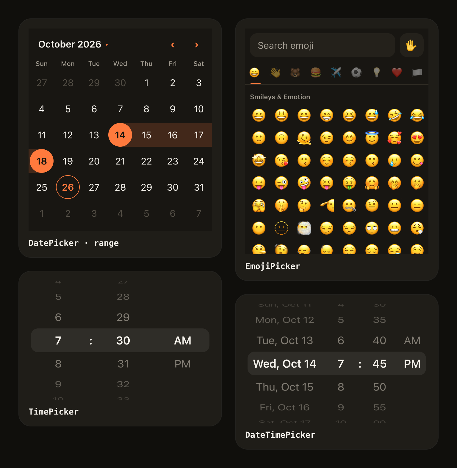
PickersProvider, or per component. - International. Month, weekday and AM/PM names, the 12/24-hour clock, the first day of the week and the date-wheel order all come from
Intlfor any locale. Layouts flip for RTL. - Accessible. Wheels are
adjustable(VoiceOver / TalkBack swipe up and down). Days announce their full date, and selected / disabled states are exposed. - Fast. Animations use the native driver. Wheels and the emoji grid are virtualized with fixed row layouts, and rows are memoized.
- Typed. Written in TypeScript, with generics for value types and discriminated unions for selection modes, so
mode="range"gives you a typed{ start, end }.
Requirements
| Version | |
|---|---|
react | >= 18 |
react-native | >= 0.72 |
| Expo | Any SDK (works in Expo Go) |
react-native-web | Supported |
No other peer dependencies: no Reanimated, no Gesture Handler, no SVG.
Where to next
- Installation: install and optional setup
- Quick start: every picker in five minutes
- Core concepts: controlled vs uncontrolled, sheets and drafts, theming, slots
- API reference: every export in one page